
Coastal Decor for Non Anglers: A 2026 Styling Guide
Table of Contents
- Coastal Decor for Non Anglers: The Look Without the Lures
- Modern Coastal Interior Design Without the Clichés
- Coastal Wall Art for Living Rooms: Picking the Right Print
- Natural Texture Home Decor: Driftwood, Ceramic and Woven Accents
- Colour Palettes That Read Coastal, Not Themed
- Small Seaside Touches: Mugs, Plaques and Shelf Styling
- A Simple Coastal Decor Checklist for Non-Anglers
- Frequently Asked Questions
Last Updated: October 4, 2026
Coastal Decor for Non Anglers: The Look Without the Lures
Coastal decor is the practice of styling a home with the colours, textures and light of the shoreline, without turning it into a themed tribute to fishing.
The look most people want, calm, airy, quietly sea-adjacent, is easier to get right than the themed version.
The Design Council's work on colour and wellbeing in interiors is a useful starting point if you want the reasoning behind why soft coastal tones feel restful rather than sterile.
Modern Coastal Interior Design Without the Clichés
Modern coastal interior design borrows the light and palette of the coast while leaving the props behind, favouring natural materials, negative space and a limited colour range over literal marine motifs.
The best coastal rooms do not announce themselves. They feel bright, calm and slightly weathered, as if the sea is nearby rather than depicted on the wall.
What Separates Coastal Chic From Nautical Kitsch
One uses texture, light and a soft palette to suggest the shore; the other uses anchors, ship's wheels, life rings and rope to state it outright.
The practical test: remove every object with a boat, anchor or fish on it. If the room still feels connected to the sea, you had coastal decor; if it looks like a plain grey box, props were doing all the work.
Coastal Wall Art for Living Rooms: Picking the Right Print
Coastal wall art for living rooms works best as a single large, quiet piece rather than a gallery wall of small marine prints.
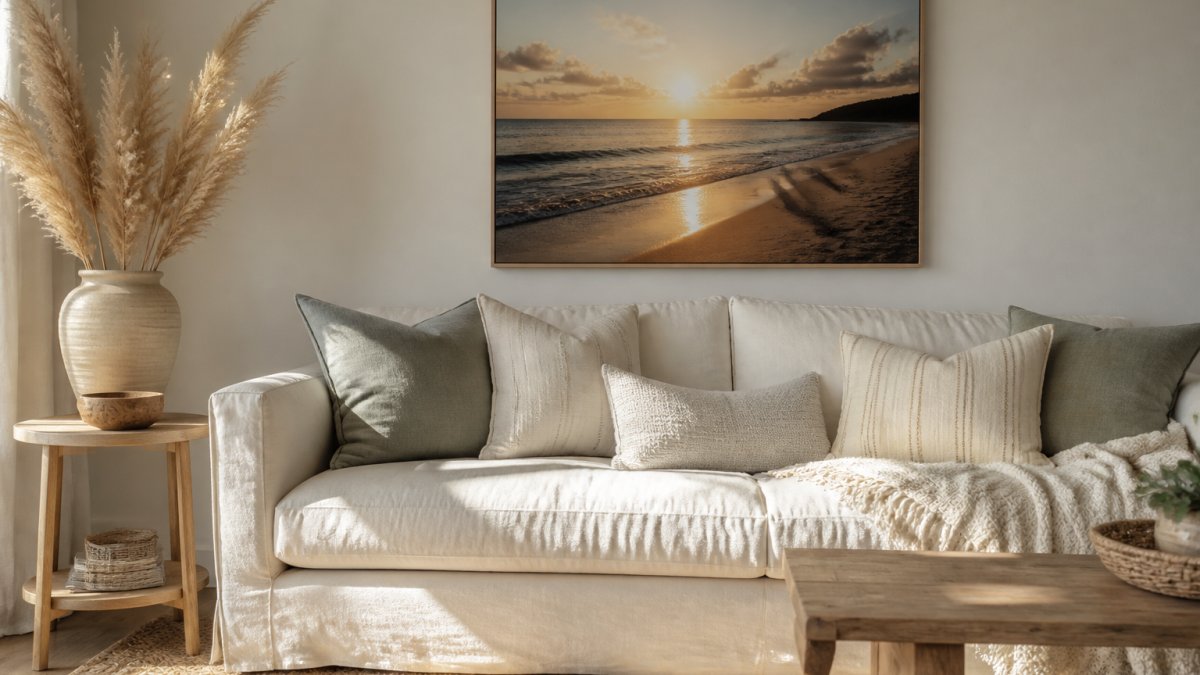
Scale is where most people go wrong.
For a living room, we would point you to the Kynance Cove fine art poster at £17.99.

If you want something softer, the Predannack Downs Lizard View poster at £12.99 shows open heathland rather than coastline.
Matte, Semi-Glossy or Framed: Matching Finish to Room
Matte suits rooms with strong natural light and a soft, muted scheme. It absorbs glare and keeps colours gentle, which is why it works for large prints in bright living rooms.
Semi-glossy adds a subtle sheen that lifts warmer tones, sunsets in particular. It is the better choice for a north-facing room where colours can otherwise look flat.
Framed is the simplest route if you want the piece on the wall the day it arrives. Our framed Mullion Cove sunset at £33.72 comes in a solid pine frame with shatterproof plexiglass and a hanging kit included, in black, white, natural or dark brown.
| Finish | Best For | Starting Price |
|---|---|---|
| Matte | Bright rooms, muted schemes | £8.78 |
| Semi-glossy | North-facing rooms, warm tones | £7.38 |
| Framed | Ready-to-hang, gifting | £25.40 |
Natural Texture Home Decor: Driftwood, Ceramic and Woven Accents
Natural texture home decor is the layer that stops a coastal room feeling flat.
Three materials do most of the work:
- Driftwood and weathered timber for shelves, frames and small sculptural pieces
- Ceramic for vases, bowls and drinkware, glazed rather than shiny
- Woven fibres such as jute, rattan and linen for rugs, baskets and cushions
A common mistake is buying all three in the same tone. Mix a pale ceramic with a darker woven basket and a greyed piece of timber, and the texture reads.
Our Ceramic Sunset Mug at £14.99 is a small, useful entry point: high-quality ceramic, 11oz, with a glossy white finish and coloured accents on the rim, inside and handle.

Colour Palettes That Read Coastal, Not Themed
Colour is where coastal styling is won or lost. The palette that reads coastal is drawn from weather and light, not flags and buoys, and the difference is mostly proportion rather than which colours you pick.
A workable starting ratio is 60 per cent neutral, 30 per cent muted blue or green, 10 per cent warm accent. Most themed rooms have inverted that: the blue does 60 per cent of the work and the neutrals are an afterthought.
The Working Palette
- Base neutrals (60%): chalk white, oyster, warm limestone, driftwood grey. These carry the walls, the largest textile and the ceiling.
- Muted mid-tones (30%): sea mist, faded eucalyptus, soft slate blue, muted sage. These go on upholstery, curtains, rugs and the second-largest surface.
- Warm accents (10%): amber, faded terracotta, aged brass, dried-grass yellow. These appear in small ceramics, a single cushion, a lamp base or a frame.
The tones you see on a headland in late autumn are the reference point: grey-green scrub, pale stone, a low warm sun. None of them are saturated, and none of them are pure.
Sunset Poster from Loe Bar, Lizard, Cornwall – Premium Matte Finish Artwork →
Why the Ratio Works
Cool, desaturated blues and greys lower visual arousal, which is why a room built on them feels calmer and reads as larger than it is.
The warm accent stops the scheme turning cold. Without it, a 60/30 neutral-and-blue room can feel like a waiting area; with roughly a tenth in amber, terracotta or brass, the eye gets a resting point and the scheme reads intentional.
Adjusting the Ratio to the Room's Light
Light direction changes how the same palette behaves.
- South-facing rooms take more cool tone than you would expect. The light is already warm, so a 60/30/10 split with a slightly stronger blue holds up.
- North-facing rooms flatten colour. Shift the ratio towards 65 per cent neutral and 25 per cent mid-tone, and lean the mid-tone warmer: sage rather than slate, eucalyptus rather than sea mist.
- East-facing rooms are cool in the morning and warm in the afternoon. Keep the palette neutral-heavy and let the accent do the work after midday.
- West-facing rooms get warm evening light that lifts terracotta and amber. This is where the 10 per cent accent can be pushed slightly.
A practical test: hold your paint chips against the wall at the time of day you actually use the room, not at midday when the light is at its most forgiving.
The Three Most Common Colour Mistakes
- Saturated marine blue on every wall. It reads cold, shrinks the room and forces every accessory to fight it. Keep strong blues to cushions, art and small ceramics instead.
- All-neutrals with no accent. Safe, but it reads unfinished rather than calm. The 10 per cent warm accent is what makes the restraint look deliberate.
- Matching the blue to the sea in a photograph. Photographic sea blue is more saturated than anything that works on a wall. Take the grey-green of the water on an overcast day, not the turquoise of a holiday brochure.
Small Seaside Touches: Mugs, Plaques and Shelf Styling
Small pieces carry a coastal scheme further than one big gesture, provided they are chosen with restraint. Most people style a shelf by adding until it looks full, which is the opposite of what works: three objects of different heights and materials beat a shelf crowded with souvenirs.
The Three-Object Rule
Build every shelf or sideboard in threes, and make each object do a different job:
- A vertical anchor, a framed print, a tall vase, a stack of two or three books. This sets the height of the vignette.
- A horizontal weight, a bowl, a tray, a low ceramic dish. This grounds the group and stops it floating.
- A textural accent, a piece of driftwood, a dried stem, a small woven basket. This is what the eye actually reads as coastal.
Vary the heights so the tallest object is roughly one and a half times the shortest, leave visible gaps between objects, and style in odd numbers because the eye finds an even grouping static.
A Worked Example
Take a 90 cm shelf above a sideboard. Place a framed print at one end, roughly 40 cm tall, a low ceramic bowl about 10 cm high set slightly off-centre, and a single dried stem in a narrow vase at the opposite end, around 30 cm tall.
If the shelf still looks bare, the answer is almost always a larger anchor object rather than more small ones.
What to Buy First, Second and Third
- First: the wall piece. It sets the palette and the scale for everything else on and around the shelf.
- Second: one ceramic object in a neutral or muted tone. This is your horizontal weight and it will be used in every future arrangement.
- Third: one natural-texture accent, ideally something you found rather than bought. A piece of weathered timber or a dried stem costs nothing and does more than a themed ornament.
For a low-cost starting point, the Cornish Engine House poster at £7.38 brings industrial heritage rather than shoreline, and it works surprisingly well in a coastal scheme because the grey stone and muted sky share the same palette. The Sunset Poster from Loe Bar at £8.78 is the warmer alternative if you want pink and gold in the mix.

Our Ceramic Sunset Mug at £14.99 works as the horizontal weight on a smaller shelf: high-quality ceramic, 11oz, glossy white with coloured accents on the rim, inside and handle, and both microwave and dishwasher safe. It earns its place because it is used, not just displayed.
The Bait-Shop Test
Before you call a shelf finished, count the objects that depict a fish, a boat, an anchor or a net. If the answer is more than zero, remove them and look again. A shelf that still reads coastal without those motifs was styled with materials and proportion, not props.
Every print in our range is produced on FSC-certified paper and printed on demand from original photography, which keeps waste down compared with holding stock.
A Simple Coastal Decor Checklist for Non-Anglers
Use this checklist before you buy anything. It takes five minutes and saves a lot of returns.
- Choose your palette first: two neutrals, one muted blue or green, one warm accent
- Pick one large wall piece rather than several small ones
- Add three textures: timber, ceramic, woven
- Remove any object with an anchor, boat or fish on it, then reassess
- Check the finish against the room's light: matte for bright, semi-glossy for dim
Work through it in order and the room will come together without a single lure in sight.
Getting a coastal scheme right is less about buying more and more about choosing well: one strong print, a considered palette, and a few honest textures.
Frequently Asked Questions
How do I style a coastal home without using fishing-themed decor?
Lean on landscape rather than equipment. Choose coastal decor that shows places, light and weather instead of boats, nets and rods. A photographic print of a headland at dusk, a plain ceramic mug with a sunset glaze, or a piece of driftwood on a shelf all carry the seaside feeling without a single angling motif. Keep the palette to two or three colours, add one natural texture, and let the view do the talking.
What are the best colour palettes for a modern coastal interior?
Repeating the same three colours is what makes a room feel designed rather than decorated.
What are some budget-friendly ideas for coastal decor?
Start with wall art, because it changes a room more than anything else for the least money. Unframed prints from Drift and Cast begin at £7.38 for the Cornish Engine House Poster and £8.78 for the Sunset Poster from Loe Bar, and both come in 29 sizes, so you can fill a small gap or a whole wall. Add a £14.99 ceramic mug for a shelf or kitchen counter, and use a single piece of driftwood or a woven basket you already own.
How can I incorporate natural textures into a coastal living room?
Limit yourself to three textures and repeat each one twice. Linen or cotton for cushions and throws, ceramic for mugs and vases, and untreated wood for frames or a small side table. Drift and Cast's framed prints use solid pine wood with shatterproof plexiglass, which brings timber into the room without extra furniture. Avoid glossy finishes and plastic; matte surfaces hold the light the way a shoreline does.