
Is Print on Demand Art Good Quality? A 2026 Guide
Table of Contents
- How to Judge Print on Demand Art Quality Before You Buy
- The Three Specifications That Decide Everything
- Giclée Print Quality Standards: What Separates Fine Art from a Poster
- Best Paper Types for Art Prints: Weight, Coating and Archival Life
- How to Check Print Resolution for Art Before You Order
- A Technical File Preparation Guide for Artists and Buyers
- Post-Production Quality Control and Archival Testing: What POD Providers Skip
- How to Test a Print on Demand Supplier Before Committing
- Frequently Asked Questions
Last Updated: September 11, 2026
How to Judge Print on Demand Art Quality Before You Buy
Print on demand art quality depends on three things you can check before spending a penny: the printing method, the paper specification, and the resolution of the source file. This guide from Drift and Cast explains how to assess each one, so you can tell a genuine fine art print from a cheap poster without seeing it in person.
Most buyers assume all online art prints are roughly the same. They are not: a 12-colour giclée print on 250 gsm archival paper is a different product from a four-ink poster on thin stock, even at similar prices.

Below: the specifications that matter, the file preparation standards that separate serious studios from resellers, and the checks to run before committing.
The Three Specifications That Decide Everything
Three specifications determine whether a print looks rich or washed out: colour gamut, paper weight, and resolution. Everything else is marketing.
Colour gamut is the range of colours a printer can reproduce. Wider gamut means deeper blues, richer greens, and smoother transitions in skies and water. A 12-pigment-ink machine outperforms a four-colour office printer here.
Paper weight, in gsm (grams per square metre), dictates how substantial a print feels. Under 170 gsm reads as disposable; fine art prints sit between 200 and 250 gsm.
Resolution, in dpi (dots per inch), governs sharpness. A print needs a source file of at least 300 dpi at final output size; below that, edges soften and fine detail disappears (printwiki.org).
Get these three right and you have a print worth framing; get one wrong and no design rescues it.
Giclée Print Quality Standards: What Separates Fine Art from a Poster
Giclée printing is a pigment-based inkjet process using a wider ink set than standard commercial printing, producing smoother gradients and greater colour accuracy. The term signals intent: giclée is for fine art reproduction, not mass-market posters.
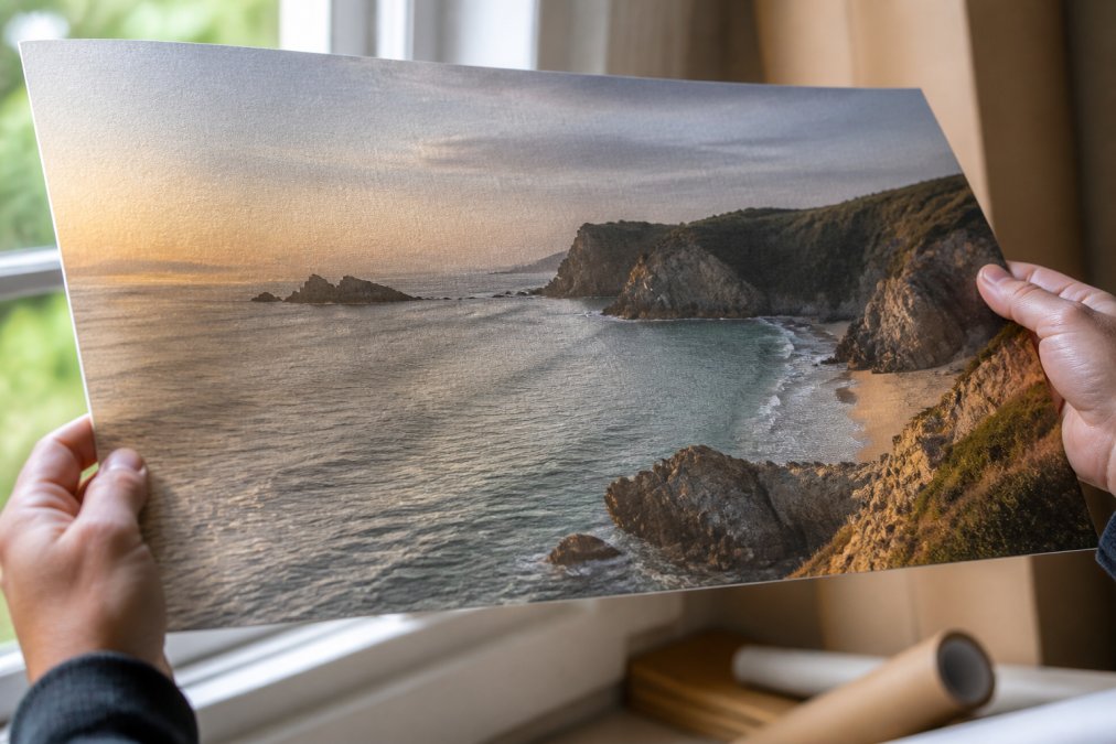
Ink Count, Lightfastness and Colour Gamut
Ink count is the clearest single indicator of giclée quality. A four-ink printer produces a limited colour gamut; a 12-colour printer adds dedicated inks for subtle mid-tones, which matters in coastal and landscape work where skies shift gradually from pale to deep.
Lightfastness describes how long a print resists fading under light. Museum-grade pigment inks hold colour for decades when framed behind glass and kept out of direct sunlight; dye-based inks fade far sooner.
What most guides miss is that ink count and lightfastness are separate claims. A supplier can use archival pigments but only six inks, or twelve inks that are not archival. Ask about both.
Best Paper Types for Art Prints: Weight, Coating and Archival Life
The best paper for art prints is acid-free, at least 200 gsm, and matched to the finish your artwork needs. Acid-free (pH-neutral) paper resists the yellowing and brittleness that degrade cheap stock.
Paper weight tells you how the print handles: 170 gsm feels like a stiff poster, 200 gsm like a proper art print, and 250 gsm substantial enough to frame without backing board.
Coating changes how colour reads. Matte papers scatter light and suit muted, atmospheric work. Glossy and semi-glossy papers boost contrast and saturation but can glare under direct light.

Archival life is the long game. Acid-free, FSC-certified stock stored correctly will outlast the frame around it.
Matte vs Glossy: What Each Finish Does to Your Art
Matte finishes suit earthy, understated artwork. They absorb rather than reflect light, so a coastal print in soft greys and greens reads as intended, with no glare.
Glossy and semi-glossy finishes increase colour punch: deep blues and turquoises appear more vivid, which suits dramatic seascapes. The trade-off is reflection, hang one opposite a window and you will see yourself in it.
For most coastal and fishing art, matte is the safer choice. It photographs well, frames cleanly, and never fights the room.
How to Check Print Resolution for Art Before You Order
Check print resolution by confirming the source file is at least 300 dpi at final print size. A supplier who will not confirm this is likely upscaling low-resolution images.
The quick maths: a 300 dpi file for a 40 cm x 50 cm print needs roughly 4,700 x 5,900 pixels. If the original is smaller, the printer either enlarges it (softening detail) or prints at lower dpi (visible grain).
Three questions to ask before ordering:
- What is the source file resolution in dpi at my chosen size?
- Is the file printed natively or upscaled?
- Can you send a sample order so I can check sharpness myself?
That last one matters most. A sample order costs little and tells you more than any specification sheet.
FSC guidance on responsible paper sourcing
A Technical File Preparation Guide for Artists and Buyers
File preparation decides final quality more than any printer setting, and a perfect press cannot rescue a poorly prepared file. Most print on demand guides skip this entirely, telling you which supplier to use rather than how to prepare artwork that survives the press.
Colour Profiles: What to Embed and Why
Artists should supply files in CMYK for print, not RGB. RGB files are built for screens and contain colours most printers cannot reproduce; converting at the press causes muddy, unpredictable results.
For fine art reproduction, the two colour profiles you will encounter most often are:
- Adobe RGB (1998), a wider gamut than sRGB, suitable for images with saturated greens and cyans. Common in photography workflows.
- sRGB IEC61966-2.1, the safe default. If your camera or scanner outputs sRGB, keep it. Converting to a wider space after the fact adds no colour information.
For CMYK conversion, most UK fine art printers work to FOGRA39 (coated stock) or FOGRA51/52 for newer presses. Ask which profile your supplier uses and convert yourself rather than letting the press convert on the fly. A soft-proof using the correct ICC profile shows which colours will shift before you commit.
Resolution, Bleed and Trim: The Numbers That Matter
Bleed is the extra margin beyond the final cut line, usually 3 mm per edge, preventing white edges if the trim drifts. Without it, a print can arrive with a sliver of unprinted paper along one edge. Trim marks sit outside the bleed area, not inside the artwork.
Artists who print successfully export a flattened TIFF or high-quality JPEG at 300 dpi with the correct ICC profile, 3 mm bleed and crop marks. They do not send layered PSDs or PDFs with transparency unless the printer has confirmed they can handle them.
The Buyer's Verification Checklist
For buyers, the checklist is simpler:
- Ask whether the file is print-ready (CMYK or correctly profiled RGB, 300 dpi, bleed included)
- Request the paper specification in gsm and confirm it is acid-free
- Confirm the printing method (giclée, pigment inks) in writing
- Ask which ICC colour profile the printer uses and whether they soft-proof before printing
- Order one sample before committing to a larger purchase
FSC guidance on responsible paper sourcing
Post-Production Quality Control and Archival Testing: What POD Providers Skip
Post-production quality control is where most print on demand providers cut corners, because checking every print costs time and money. The best studios inspect for colour accuracy, edge sharpness, and surface defects before packing. Here is what that inspection involves, what archival testing means, and how to handle a print that fails.
What a Real Quality Control Check Looks Like
A proper post-production inspection is a structured check against the following:
- Colour accuracy, comparing the print against a soft-proof or a previously approved sample under standardised lighting (typically D50 or D65, the same conditions used in print evaluation).
- Edge sharpness, checking that fine lines and text have not filled in or broken up, which indicates ink spread or resolution loss.
- Surface defects, looking for banding (visible lines where ink density changes), bronzing (a metallic sheen on dark areas caused by pigment sitting on the surface rather than absorbing), and micro-scratches from handling.
- Trim accuracy, confirming the cut falls within the bleed margin and that no unprinted paper is visible at the edges.
Most print on demand operations print, pack, and ship without this. The ones that do will tell you about their process unprompted.
Archival Testing: What It Actually Means
Archival testing is rarer still: accelerated ageing under controlled light and humidity to estimate how a print will look in ten or twenty years. Very few print on demand operations run it.
The industry reference point is the ISO 9706 standard for permanent paper, which specifies requirements for paper that resists ageing. For prints, the relevant measure is often lightfastness, rated on the Blue Wool Scale, a 1 to 8 scale where 8 indicates negligible fading after extended light exposure. Museum-grade pigment inks typically rate 6 or above on this scale when printed on archival stock.
A supplier who claims archival quality should be able to tell you:
- The paper's ISO 9706 compliance or equivalent permanence standard
- The ink's Blue Wool Scale rating
- Whether the print is expected to last decades without noticeable fading under normal indoor conditions
If they cannot answer these, the word 'archival' is marketing, not a specification.
Handling a Print That Fails
Even with good quality control, defects happen, and how a supplier handles them tells you more than any specification sheet.
Buyers who receive a defective print typically photograph the defect in natural daylight, note the order number and the specific issue (colour shift, banding, trim error), and contact the supplier within the return window. Suppliers with real quality control replace without argument; those without offer a partial refund or blame the file.
Under the Consumer Rights Act 2015, goods must be of satisfactory quality, fit for purpose, and as described. A print that arrives with visible banding or a colour shift from the approved sample is not as described. You are entitled to a repair, replacement, or refund. Knowing this before you order changes how you evaluate a supplier's returns policy.
Packaging: The Last Line of Defence
Prints should ship flat or in rigid tubes with an inner protective layer, not flimsy envelopes that bend in transit. Shipping damage is the most common print on demand complaint, and it is almost entirely preventable.
The fine art standard is a rigid tube with acid-free tissue interleaved between prints, capped at both ends, and shipped in a box rather than a bag. If a supplier ships in a padded envelope, the print is at risk regardless of the press.
At Drift and Cast, every print is produced on demand from original coastal artwork, using archival matte paper at 250 gsm on our Master's Edition line and 12-colour giclée printing on our fine art posters. You can see the difference in the Kynance Cove 12-colour giclée print, where the turquoise water and serpentine rock hold their depth on 200 gsm matte stock. You can see the difference in the Kynance Cove 12-colour giclée print, where the turquoise water and serpentine rock hold their depth on 200 gsm matte stock.

How to Test a Print on Demand Supplier Before Committing
Test a print on demand supplier with one small order, then examine it against five criteria before buying anything else. This costs a fraction of a full order and removes nearly all the risk.
| Check | What to Look For | Why It Matters |
|---|---|---|
| Paper weight | 200 gsm or above, stated clearly | Thin stock feels cheap and buckles |
| Ink type | Pigment, not dye | Dye fades within a few years |
| Resolution | 300 dpi at final size | Below this, detail softens |
| Packaging | Rigid tube or flat board | Prevents bent corners in transit |
| Sample policy | Willing to send one print | Confident studios say yes |
Run the sample through the checks in this guide: hold it to the light, look at the gradients, check the edges for bleed errors. If it passes, order with confidence. If the supplier dodges any question, that is your answer.
Judging print on demand art quality comes down to specifications you can verify rather than reputations you have to trust. Ask about paper weight, ink type, and resolution, order a sample, and inspect it properly. At Drift and Cast, we print every piece on archival, FSC-certified stock, from 250 gsm matte on our Master's Edition prints to 12-colour giclée on our fine art posters, so the coastal scenes you choose hold their depth for years. Browse the collection and see the difference archival production makes.
Frequently Asked Questions
Is print on demand art good quality?
It depends entirely on the specifications the provider uses. A print on demand art piece can match gallery quality when it uses giclée printing with 8 or more ink colours, acid-free paper of at least 200 gsm, and a print resolution of 300 dpi. Lower-cost options often use 4-colour inkjet on thin, coated paper, which looks acceptable on a screen but fades and warps within a few years. The technology is capable of excellent results; the question is whether the provider invests in it.
Are giclée prints better than standard print on demand posters?
Giclée printing uses a wider colour gamut, often 8 to 12 ink colours compared to the 4 used in standard poster printing. That means smoother gradients, richer mid-tones and far better accuracy when reproducing fine art. Standard posters printed on lightweight paper serve well for temporary display or budget framing, but giclée print quality standards exist specifically because pigment inks on archival substrates resist fading for decades rather than months.
How does paper weight affect the quality of art prints?
Paper weight, measured in gsm, determines how substantial a print feels and how well it holds ink without cockling or buckling. Anything under 170 gsm feels flimsy and creases easily during framing. Between 200 and 250 gsm is the sweet spot for most art prints, offering enough rigidity for clean framing without excessive cost. Above 300 gsm you enter museum-grade territory, where the paper itself becomes part of the artwork's longevity.
How can I test the quality of a print on demand supplier?
Order a sample before committing to a large run or a high-value purchase. Examine the print under natural light for banding, colour shifts and detail loss in shadows. Check the paper's weight by feel and look for an acid-free or FSC certification on the packaging. Hold it at an angle to spot uneven coating. A supplier confident in their output will offer sample orders, clear specifications and a returns policy that covers print defects.