
How Do You Spot a Quality Art Print?
Last Updated: October 25, 2026
Quick Summary
To identify quality art prints, judge each print against the process that made it: giclée should show smooth tonal transitions and no visible dot pattern, while screenprints should have even ink coverage and deliberate texture. Check the label for the named process, pigment or dye ink, paper weight in gsm and acid-free stock.
- A serious fine art giclée uses eight, ten or twelve inks, not the standard four.
- The best paper for art prints is acid-free, between 200 and 300 gsm, with a matte or natural finish.
- Archival art prints use pigment inks and acid-free paper to resist fading and yellowing for decades.
- A print marked 12/50 is the twelfth of an edition of fifty; smaller editions are generally more collectable.
- Inspect two candidates side by side under the same light and run the same checks on each.
Table of Contents
- Start With the Printing Process
- Giclée Print Quality: What Separates a Good One From a Bad One
- The Best Paper for Art Prints: Weight, Texture and Acid-Free Stock
- Why Archival Art Prints Last Longer
- Limited Edition Art Prints: Edition Size, Signatures and Certificates
- A Side-by-Side Inspection Checklist for Any Print
- How to Judge Quality Art Prints When You're Shopping Online
- Choose a Print That Earns Its Wall Space
- Frequently Asked Questions
Start With the Printing Process
Most buyers judge a print by its picture. The real tell is how it was made.
Here is what the common labels actually mean:
- Giclée: a pigment-ink printer laying down microscopic droplets at high resolution. The standard for photographic and fine art reproduction.
- Lithograph: traditionally a stone or plate process; modern offset litho is the commercial version, fast and cheap at volume.
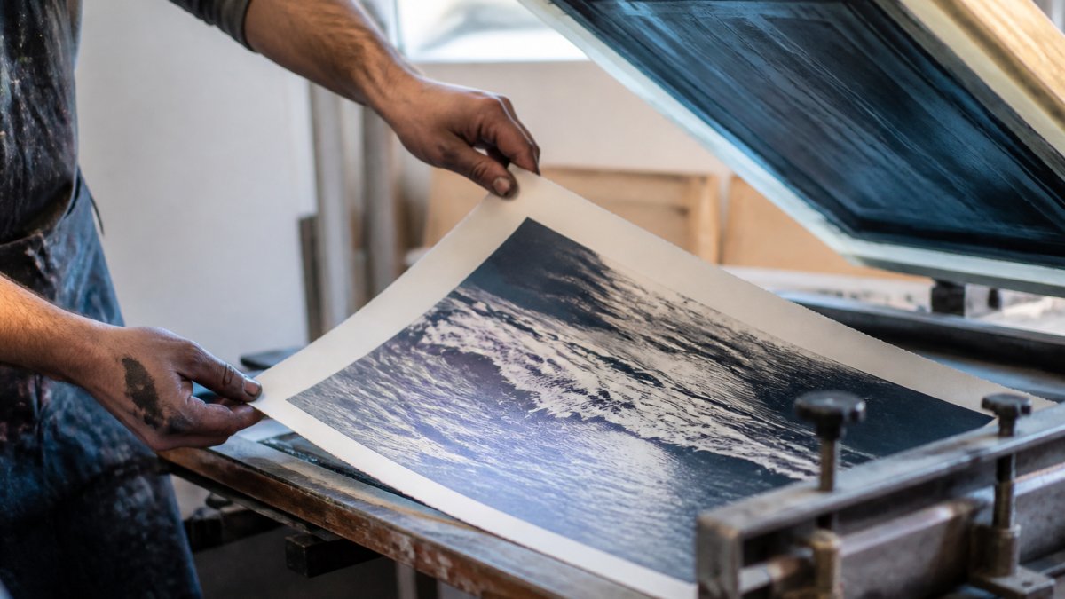
- Screenprint: ink pushed through a mesh screen, one colour at a time. Bold, tactile, and usually a handmade or limited-run product.
If you want the longer version of this, our guide on whether print on demand art is good quality explains how these methods compare in practice.
Giclée, Lithograph, Screenprint: What the Labels Mean
A giclée print is made with pigment inks on an inkjet printer built for fine art. A lithograph is a commercial reproduction, usually offset. A screenprint is a hand-pulled or short-run piece where ink sits on top of the paper.
The label matters because it tells you what to expect. A giclée should show smooth gradients and fine detail. A lithograph can look good but often flattens in the shadows.
What Quality Looks Like in Each Process
Applying one standard to every print is the mistake most buyers make.
Giclée. Quality shows as smooth tonal transitions, detail held in dark shadows, and no visible dot pattern at reading distance.
Offset litho. Quality shows as consistent colour across the whole run and clean, sharp type and edges.
Screenprint. Quality shows as even ink coverage, crisp edges to each colour layer, and deliberate texture.
Reading the Label Without Being Misled
Labels are marketing as much as description. "Fine art print", "gallery quality" and "museum grade" have no fixed legal meaning in the UK, so treat them as claims to verify rather than facts. The details that actually tell you something are the named process, the ink type (pigment or dye), the paper weight in gsm and whether it is acid-free, and the printer or studio that produced it.
Each printing process has its own quality tells, so judge a print against the method that made it.
| Process | What quality looks like | Common faults |
|---|---|---|
| Giclée | Smooth tonal transitions, detail in shadows, no visible dot pattern | Banding in skies, colour cast, softness from upscaling |
| Offset litho | Consistent colour across the run, sharp type and edges | Flat shadows, misregistration, visible halftone dots |
| Screenprint | Even ink coverage, crisp colour edges, deliberate texture | Ink bleed under screen, patchy coverage, out-of-register layers |
| Photographic print | Continuous tone, no dot pattern, even density | Scratches or dust marks |
| Etching or linocut | Plate mark, even bite of ink, crisp line | Not a reproduction but an original print |
Giclée Print Quality: What Separates a Good One From a Bad One
A good giclée print has three things: a high-resolution source image, a printer using more than the standard four inks, and a paper suited to pigment ink. Miss any of these and the result looks flat or soft.
The ink count is the giveaway most buyers never check. Standard printing uses four colours.
Look at our Kynance Cove 12-colour giclée poster and you can see the difference a wider ink set makes on coastal tones, where subtle blues and greens are easy to get wrong.

Watch out: a seller calling a standard four-ink inkjet output a "giclée" is the most common mislabelling in the market. Ask how many inks the printer uses before you buy.
The Best Paper for Art Prints: Weight, Texture and Acid-Free Stock
The best paper for art prints is acid-free, between 200 and 300 gsm, with a matte or natural finish that suits the image. Weight gives the print presence in the hand; acid-free stock stops it yellowing.
Here is how the numbers translate:
- Under 200 gsm: flimsy, prone to cockling, feels like a poster.
- 200 to 250 gsm: the practical sweet spot for most wall art.
- 300 gsm and above: heavy, gallery-grade, lovely to handle.
Texture is a taste call. Smooth matte suits photography. Cotton rag paper adds a soft grain that suits traditional printmaking. Either works, as long as the stock is acid-free.
Why Archival Art Prints Last Longer
Archival art prints are made to resist fading and yellowing for decades, using pigment inks and acid-free paper.
Light is the enemy. Even an archival print will fade if it hangs in direct sun, so keep it away from windows and consider glazing with UV-filtering glass.
Our Winter Fishing at Mullion Cove archival print uses 250 gsm acid-free matte paper for exactly this reason: it is built to still look right in twenty years.
Kynance Cove Fine Art Poster, Cornwall →

guidance on framing and displaying works on paper
Limited Edition Art Prints: Edition Size, Signatures and Certificates
Limited edition art prints are released in a fixed number, and that number is the edition size. A print marked "12/50" is the twelfth of fifty. Smaller editions are generally more collectable.
Check these before you pay a premium:
- Edition number: written as a fraction, usually bottom left.
- Artist signature: pencil, not printed, is the norm for a genuine limited run.
- Certificate of authenticity: states the edition size, the process and the paper.
Provenance is the paper trail behind the print: the gallery, the receipt, the certificate. Keep all of it. Without provenance, a limited edition is hard to verify and harder to resell.
How to Verify Authenticity and Provenance
No single marker proves a print is genuine. A pencil signature can be forged, a certificate can be printed by anyone, and an edition number can be added after the fact. Verification means checking several signals that agree with each other, and being honest that even then you are weighing evidence, not proving a fact.
Work through these steps:
- Read the markings as a set. The edition number, signature, title and any chop or studio stamp should be consistent in medium, placement and date. A print signed in ink while the certificate says pencil is a mismatch worth questioning.
- Check the certificate against the print. The edition size, process and paper on the certificate should match what you can see and feel. A certificate that names a paper weight the print clearly does not have is a warning.
- Ask for the provenance chain. A receipt, a gallery invoice or a previous sale record is stronger evidence than a certificate alone. Ask who published the edition and when.
- Look the artist and publisher up. A working artist or established studio usually has a record of their editions. If the seller cannot name the publisher, treat the edition claim as unverified.
- Inspect the signature itself. Under a loupe, a printed signature shows a dot pattern; a pencil signature sits on the surface with slight variation in pressure. This distinguishes printed from hand-signed, though not genuine from forged.
- Check the condition. Foxing, fading, trimmed margins or a print that has been re-framed badly all affect both authenticity assessment and value.
What Edition Markings Do and Do Not Tell You
An edition number tells you where a print sits in a stated run. It does not tell you the run was honestly declared, that the artist signed it, or that the print is worth more than a reproduction.
If you are buying to enjoy rather than to collect, the markings matter less than the print itself. If you are buying with resale in mind, keep every document, store the certificate flat and dry, and record the seller's details.
A Side-by-Side Inspection Checklist for Any Print
To inspect a print properly, compare two candidates side by side under the same light and work through the same checks on each. Judgement is far easier when you have a reference point.
Run this checklist on both prints:
- Hold at an angle: is the surface even, with no banding or streaks?
- Check gradients: do skies and shadows blend smoothly or step?
- Look at fine detail: are edges crisp or soft and pixelated?
If you are checking a framed piece, look at the mount and frame quality too. Our Framed Poster Of Penryn River Falmouth High Quality Pine Wood Frame With Luxury Matte Finish shows the frame and matte details up close.
How to Judge Quality Art Prints When You're Shopping Online
Judging quality art prints online comes down to the listing. A good seller tells you the process, the paper weight, the ink type and the sizes, and shows sharp close-up images. A vague listing is a warning.
Ask yourself these questions before you buy:
- Does the description name the printing process and the paper weight?
- Is there a close-up photo showing paper texture and detail?
- Are the sizes listed clearly in centimetres?
- Is the seller clear about how the print is packed and shipped?
A listing that spells out its specs gives you something concrete to judge against. Compare the description to the checklist above. If the seller will not tell you the paper weight or the ink type, assume the worst.
consumer rights on distance selling and returns
Choose a Print That Earns Its Wall Space
The test of a quality print is simple: it should still look sharp and true in a decade. That means the right process, acid-free paper and pigment inks, plus markings you can verify.
At Drift and Cast, every print is made to that standard. Our posters use FSC-certified paper, printed on demand from original coastal photography, so nothing sits in a warehouse fading before it reaches you.
Frequently Asked Questions
How can you tell if an art print is good quality?
Look at four things: the paper, the ink, the printing process and the seller's description. Good quality art prints use acid-free paper of at least 200 gsm and pigment inks rather than dye-based ones. Hold the print at an angle to check for banding, pixelation or muddy shadows. A seller who names the paper weight, the print method and the ink type is usually confident in what they are selling. Vague listings that say only 'premium print' are a warning sign.
What is the difference between a giclée print and a regular print?
A giclée print is made on a high-resolution inkjet printer using pigment inks, which sit on the paper surface and resist fading far better than dye-based inks. Regular prints are often produced on cheaper paper with dye inks, and they tend to lose colour within a few years in daylight. Giclée print quality also depends on the paper: a 12-colour giclée on 200 gsm matte stock, like the Kynance Cove Fine Art Poster, holds far more tonal depth than a standard inkjet copy.
How can you tell if a print is archival?
Archival art prints use acid-free paper, usually described as pH neutral or pH 7+, plus pigment inks rated for lightfastness. Ask the seller for the paper weight and whether it is acid-free. A 250 gsm acid-free stock, such as the paper used for the Winter Fishing at Mullion Cove Art Print, will not yellow the way cheap pulp paper does. If a listing gives no paper or ink details at all, assume it is not archival.
How do you know if an art print will fade?
Fading comes down to ink type and where you hang the print. Pigment inks last considerably longer than dye-based inks, and acid-free paper slows yellowing. Keep prints out of direct sunlight and away from radiators or damp walls to extend their life. When buying, check whether the seller specifies pigment inks and archival paper. A limited edition art print with a certificate of authenticity usually signals that the maker expects the piece to last.
A wall deserves better than a print that fades in two summers. If you want coastal art made with the process and paper to last, Drift and Cast prints on FSC-certified stock from original photography, with archival options and clear specs on every listing. Get started with Drift and Cast and give your wall something worth keeping.
