
Understanding Color Profiles for Art Reproduction
Last Updated: October 31, 2026
Quick Summary
Color profiles are sets of data that tell each device how to interpret color values, so the same file looks consistent on screen and in print. Without them, your monitor and printer speak different color languages, and subtle gradients in fine-art reproduction show every error.
- RGB offers a wider gamut and suits fine-art workflows that convert at the printer; CMYK is narrower and print-realistic.
- An ICC profile must match both the printer and the paper, since matte cotton rag and semi-gloss stock render ink differently.
- Use output profiles to soft proof and drive the print dialog, never to overwrite your master image.
- Export Procreate artwork with an embedded standard RGB profile, because untagged files force the printer to guess.
- Calibrating your monitor with a hardware device is the single highest-value step for accurate color.
Table of Contents
- What Color Profiles Are and Why They Matter for Art Reproduction
- RGB vs CMYK for Art Printing: Choosing the Right Color Space
- ICC Profiles for Art Prints: How to Get the Correct Printer and Paper Profile
- Soft Proofing Artwork for Print: Test Prints and Out-of-Gamut Warnings
- Procreate Color Profiles for Printing: Exporting Digital Art Correctly
- Calibrating Your Screen, Scanner and Printer for Accurate Color
- Troubleshooting Color Shifts: A Decision Tree for Dull or Inaccurate Prints
- Ordering a Fine Art Print from Drift and Cast
- Frequently Asked Questions
What Color Profiles Are and Why They Matter for Art Reproduction
A color profile is a set of data that tells a device how to interpret color values, so a specific set of numbers produces the same visual result on screen and in print. Understanding color profiles for art reproduction starts here: without them, the same file looks different on every monitor and every printer. Colour management matters on every giclée print, because a coastal photograph lives or dies on whether the turquoise of Kynance Cove survives the journey from camera to paper.
The core problem is simple. Your monitor and your printer speak different colour languages. The profile is the translator.
Colour management matters most for fine-art print, where subtle gradients in sky and water show every error. If you are weighing up how good a print-on-demand piece can actually look, our guide to print-on-demand art quality covers what separates a sharp reproduction from a muddy one.
RGB vs CMYK for Art Printing: Choosing the Right Color Space
RGB and CMYK are two different ways of describing colour, and choosing between them for art printing depends on where the file is going and what your print provider actually needs. RGB builds colour from red, green and blue light and gives you a wider gamut, which suits screens, cameras and digital art. CMYK mixes cyan, magenta, yellow and black ink on paper and gives you a narrower, print-realistic range.
The decision is not simply 'RGB for giclée, CMYK for press'. It hinges on the print provider's workflow. Some fine-art printers ask for RGB files and convert internally using their own ICC profiles, which preserves more of the original colour because the conversion happens once, at the output stage, with full knowledge of the printer and paper.
| Colour space | Best for | Gamut | When to use |
|---|---|---|---|
| RGB | Screens, cameras, digital art, giclée workflows that convert at the printer | Wider | Default for fine-art and photo printing unless the provider says otherwise |
| CMYK | Press, litho, some commercial print providers | Narrower | Only when the provider explicitly requests it, or when you are contract-proofing to a press standard |
A common pattern is to keep a master RGB file as your archive and export a CMYK copy only for the specific provider that demands it. That way an unnecessary conversion never touches your original.
Watch for providers who say 'we accept both' without specifying a preferred profile. In that case, ask which working space they expect (sRGB, Adobe RGB, or a specific CMYK standard) and whether they want the profile embedded. A file that arrives in the wrong space, even if technically valid, can print dull or shifted because the provider's rip assumes something different.
ICC Profiles for Art Prints: How to Get the Correct Printer and Paper Profile
An ICC profile is a standard file that describes exactly how one device, or one device-and-paper combination, reproduces colour. For art prints, the profile you need is specific to both the printer and the paper, since a matte cotton rag and a semi-gloss stock render ink very differently. There are three broad types you will encounter: working-space profiles (such as sRGB, Adobe RGB, or ProPhoto RGB) that define the colour space you edit in; device profiles that describe a scanner, monitor, or printer; and output profiles that combine a printer, ink set, and paper into a single description.
Getting the right output profile usually means downloading it from your print provider or paper manufacturer for that exact combination. If you are weighing the effort of proper profiling, it helps to understand why art prints are expensive. A generic profile will get you close; a paper-specific one gets you accurate.
Installing a profile is straightforward: on macOS, place the .icc or .icm file in the system colour profile folder; on Windows, right-click and choose 'Install Profile'. Once installed, the profile appears in the soft-proofing and print dialog menus of editing software such as Photoshop, Affinity Photo, or Capture One.
Soft Proofing Artwork for Print: Test Prints and Out-of-Gamut Warnings
Soft proofing artwork for print means previewing on screen how the file will look once printed, using the destination ICC profile. It is the cheapest way to catch a problem before you commit to a full print run.
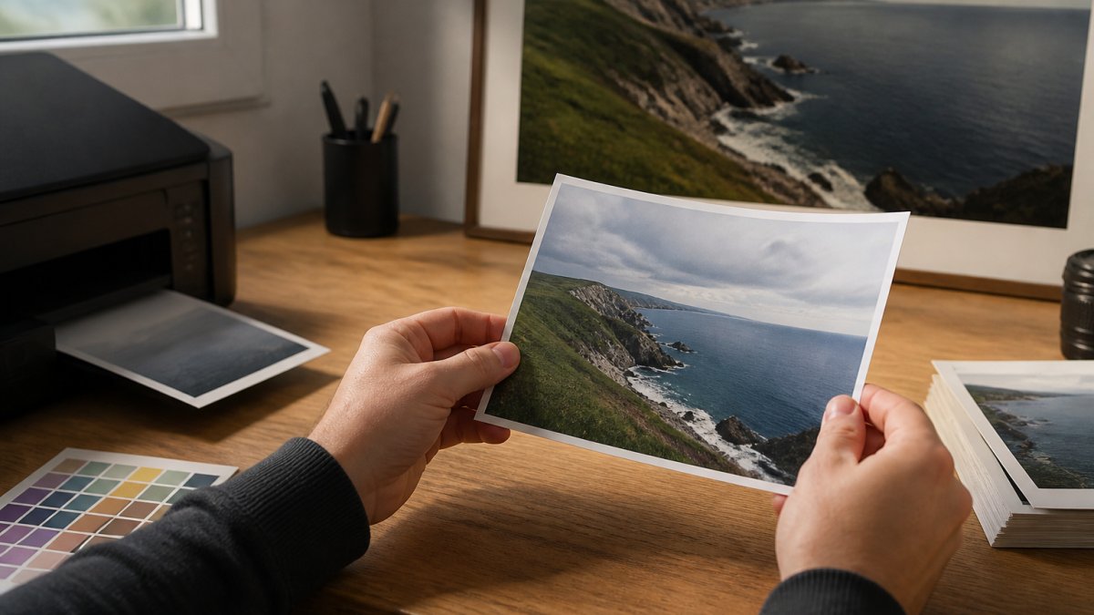
When your editing software warns that a colour is out of gamut, it means the printer cannot reproduce that exact shade and will substitute the nearest it can manage. Deep saturated blues and bright greens are common culprits. A small test print of the tricky area confirms what the warning is telling you. Once you have a proof in hand, our guide on how to spot a quality art print helps you judge the result in person.
Procreate Color Profiles for Printing: Exporting Digital Art Correctly
Procreate colour profiles for printing come down to one setting: the colour profile assigned to your canvas. Procreate works in RGB, and when you export, you choose the profile embedded in the file. For print, export with a standard RGB profile such as sRGB or, better, the wider Adobe RGB or Display P3 if your print provider supports it.
Kynance Cove Fine Art Poster, Cornwall →
The mistake most digital artists make is exporting a flat, untagged file. Without an embedded profile, the printer has to guess, and guessing produces dull or shifted colour. Always check the export settings before you send artwork to a printer, and confirm which profile your provider prefers.
Calibrating Your Screen, Scanner and Printer for Accurate Color
Accurate colour depends on calibrating every device in the chain: the scanner or camera that captures the art, the monitor you edit on, and the printer that outputs it. Each one drifts over time, and an uncalibrated monitor is the most common cause of a file that looks perfect on screen and wrong on paper.
A hardware calibration device for your monitor is the single highest-value step. For scanners and cameras, a colour reference target lets you build a profile that corrects their interpretation.
- Calibrate your monitor regularly, and re-check after any lighting change in your workspace
- View prints under consistent, neutral lighting to judge them fairly
Troubleshooting Color Shifts: A Decision Tree for Dull or Inaccurate Prints
When a print comes back dull or shifted, work through the causes in order rather than guessing. Dull colours usually trace to a missing or wrong profile; a colour shift usually traces to a gamut or conversion problem.
- Is the file tagged? If there is no embedded profile, assign the correct one and re-export.
- Did you soft proof first? If not, proof against the printer's ICC profile to see the shift before printing.
- Was the image converted to CMYK unnecessarily? Revert to the RGB original and let the printer convert.
- Is the paper profile correct? Mismatched paper and profile dulls output; download the exact combination.
- Is your monitor calibrated? An uncalibrated screen makes a correct print look wrong.
- Are the colours out of gamut? If so, the printer has substituted the nearest shade; adjust the file if the shift matters.
If the proof looks right and the print is still off, the issue is usually the viewing light, not the file. Judge prints under neutral, consistent lighting.
Ordering a Fine Art Print from Drift and Cast
The Kynance Cove print uses a 12-colour giclée process for richer tones and depth than standard inkjet. Our Kynance Cove fine art poster is printed on 200 gsm premium matte paper, and our Poltesco archival poster uses 250 gsm stock. If you want to browse a wider selection before choosing, our round-up of Cornish landscape prints gathers ten pieces worth living with.

Frequently Asked Questions
What is a colour profile in art reproduction?
A colour profile is a file that tells a device how to interpret colour values. In art reproduction, profiles for your monitor, scanner, and printer ensure the colours you see on screen match the colours that come out of the printer. Without them, the same RGB numbers can produce wildly different results, especially when moving from a bright display to paper and ink.
Should I use RGB or CMYK for art prints?
Use RGB while editing and archiving your artwork. Convert to CMYK only when your print provider requires it. RGB has a wider gamut and suits most fine-art inkjet printers, which accept RGB files and convert internally. If you are sending files to a commercial press, ask for their CMYK profile and convert at the end to avoid unnecessary colour shifts.
Which colour profile should I use for printing artwork?
Use the ICC profile supplied by your printer and paper manufacturer. For fine-art inkjet printing, that is typically a paper-specific profile you install on your computer. Never rely on a generic CMYK profile like U.S. Web Coated unless your printer explicitly asks for it.
What is the difference between sRGB and Adobe RGB?
sRGB is the standard for web and screens, with a narrower gamut. Adobe RGB covers more of the cyan-green range, which can matter for coastal and landscape photography with rich turquoise water and foliage. If your printer supports Adobe RGB and you edit in it, you will preserve more colour data, but always embed the profile so the printer knows how to interpret it.
Why do printed colours look different from the colours on my screen?
Screens emit light, while paper reflects it, so bright blues and greens often appear duller in print. This is a gamut difference, not a fault. Calibrate your monitor, soft-proof with your printer's ICC profile, and view the print under neutral lighting. If colours still shift, check that the correct profile is embedded and that the paper type matches the profile.
How do I convert artwork to CMYK without losing colour?
Convert in a copy of your file, keeping the original RGB file untouched. Use perceptual rendering intent to compress out-of-gamut colours smoothly, and keep the original RGB file untouched. After conversion, soft-proof to see where colours shift, and make targeted adjustments rather than global saturation boosts.
Do I need an ICC profile for art printing?
Yes, if you want predictable results. An ICC profile describes how a specific printer and paper combination reproduces colour. Without it, you are guessing. Install the profile, soft-proof your image, and you will see a much closer match between screen and final print.
How can I soft-proof artwork before printing?
In your editing software, choose the printer's ICC profile as the proof profile and enable gamut warning. The preview simulates how the image will look on that paper. Adjust colours that fall outside the gamut, then order a small test print. Compare it to your screen under neutral light. Soft proofing plus a test print is the most reliable way to avoid disappointing colour shifts.
Colour accuracy is not a detail you can skip if you care how a print looks on the wall. If you would rather leave the profiling, proofing and calibration to people who do it every day, that is exactly what we handle at Drift and Cast. Our prints use 12-colour giclée printing, FSC-certified papers, and profiles matched to each paper stock, so the coastline arrives as it should. Get started with Drift and Cast and bring home a coastal print that looks right the first time.
